|
|
Post by Annadesu on Sept 19, 2009 16:12:12 GMT -5
So... who do you think had the best character design? Who's appearance did you like the most? Do tell!
~~~
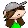
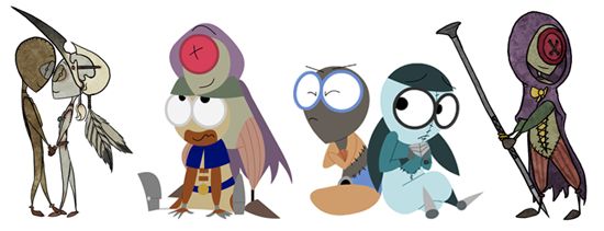
I actually thought the twins had the best design... The streamline forms (to help them zip around faster), the colors/stripes they had, the little hoods and tails... It just suited them, very well. And it made them really, really cute XD
|
|
|
|
Post by Bane on Sept 19, 2009 16:15:53 GMT -5
Actually, I wanted to say 9. He is very simplistic and not overly flashy, kinda plain actually. The only really showy thing on him is the zipper and that has a nice function and isn't just for show.
But I had to vote for 6. Very unusual, very cute, and shows us that he is mysterious and unusual right off the bat.
Also, I think you mean "Best Character Design"... not "Beast Character Design".
|
|
|
|
Post by Annadesu on Sept 19, 2009 16:20:12 GMT -5
Haha, whoops! *fixes typo* 6 was designed after Tim Burton a little, too  According to Shane XD |
|
|
|
Post by Bane on Sept 19, 2009 16:22:28 GMT -5
No problem.
I know, that makes it awesome! I love Burton and Acker's work so having a character's look based on one of them is... AWESOME.
A close second to 9 and 6 was 2. His design was so... quirky! That hat was amazingly designed!
|
|
|
|
Post by YAY on Sept 19, 2009 16:27:30 GMT -5
I, honestly, like 7's design best- she was very smooth and slick, like a well tuned machine. That, and I loved the scars on her, and the fact she cut her own number out and hid it with those feathers on her back. I mean, really Shane Acker, did you have to add something as hardcore as that to her?
I mean, she was beautiful and stong- very sexy in every meaning of the word, yet still had kind eyes and look that if you messed with her, you're going to get hurt.
Bad.
I think she just barely beats out the twins for my favorite design, because she's just so perfect for the character- and I love how she focuses herself around birds and stuff, showing the audience what kind of person she is, based on looks alone.
Who ever said you can't judge a book by its cover?
|
|
|
|
Post by Annadesu on Sept 20, 2009 9:22:06 GMT -5
No problem. I know, that makes it awesome! I love Burton and Acker's work so having a character's look based on one of them is... AWESOME. A close second to 9 and 6 was 2. His design was so... quirky! That hat was amazingly designed! Now that you mention is, 2's little bow was pretty adorable XD I was actually reading something on AWN that fit into this thread, so here it is... ~~~~ www.awn.com/articles/3d/getting-stitchpunked-i9i/page/1Joe Ksander (The Chronicles of Narnia: The Lion, the Witch and the Wardrobe), the animation director of 9, opening today from Focus Features, first met director Shane Acker when they were both at UCLA. In fact, Ksander was so impressed with Acker's initial pitch for the 9 short that he volunteered to work on it.
"We all grew up loving a certain kind of Ray Harryhausen movie and 9 had that kind of feel to it," Ksander recalls. "Then I went off and became a character animator and animation supervisor and Shane came back to me when the feature was in development and asked if I wanted to direct the animation. "
Once they got into storyboarding, Ksander came aboard and helped develop the characters and refined the design, since the feature, which was made at Starz Animation Toronto, is no garage film like the short.
"By the time the movie comes out," Ksander continues, "Shane will have been working with these characters for about nine years. The original design of the short was a little bit limited, but with the feature we had to consider how they are going to talk and how are they going to look when they talk."
Although #9, the protagonist (voiced by Elijah Wood), was essentially the same "stitchpunk" design (stop-motion-like and stitched together in burlap), they tried to refine his look to make him more expressive and appealing.
"We made his lines cleaner," Ksander explains. "And in order to see what it was like with a human voice coming out of it, we played around with the face a little bit and I even did experiments to try and make him more human and get some of Elijah Wood's face into the character, but that didn't really work: the more human it got, the weirder it became, so we pulled back and kept it really simple. It's an oval with two round eyes and a slit for a face, which means that when you're performing him, you have to do a lot more pantomime."
Coming from visual effects, Ksander admits that it was a valuable learning experience. The principles of animation may be the same, but, in some respects, visual effects animation can be more challenging because, with live-action, there's a level of reality that viewers expect., such as when dealing with Aslan from Narnia.
"What was interesting working with Shane is that he's an animator -- that's his first love -- but he's also a generalist: he models, he lights, he does story, he edits. And working in the industry, you become very specialized. I've been doing animation and design. And then when I was working with Shane, the mantra was whatever we need to do to get it done or solve a problem, so I found myself being back in film school again. I was modeling and working with rigs, working with story and editorial. It was [great] for me to go back to our roots."
And, like Acker, Ksander has nothing but praise for the talented team at Starz, which was required to go beyond what they had achieved before. "There were a couple of creatures in the film: the Fabrication Machine and the Wind Beast, the big dragon creature. We thought we were being clever by not having skin and fur, but [the Machine] was just crazy with the kind of stuff that she had to do, and Starz pushed their pipeline and their people. One thing that really helped us is that everyone was excited after seeing the early animatic.
"The other characters were a lot more fun to create because they provided a lot more freedom. Look at #1, which is a lot more expressive. He's this leader, an elderly military gentleman, and we treated him like a Shakespearean actor. And one reason we did that, of course, is we cast Christopher Plummer. So even early on when we cast him, we did a redesign on the face to push more of his look into it. He even has this old man's palsy.
"Another favorite is #7 [voiced by Jennifer Connelly]. She's the warrior and has the bird helmet and is our martial artist, but I didn't want it to look like The Matrix or Crouching Tiger. So what we ended up doing was looking at a lot of reference for parkour. Plus I looked at a lot of professional tennis players and skateboarders to give her a down to earth physicality."
Ksander says he got the most pleasure from sitting down with the animation team and basically acting out an entire sequence for them, so everyone had an idea what each character was supposed to be doing. "And then I would work with the individual animators and would shoot a lot of reference for them and get them to do the acting. So the thing I'm probably most proud of is the acting and helping find who these characters really are."
While 9 (animated in Maya) didn't have the bleeding edge of technology as a requirement -- there's no skin, hair or subsurface scattering -- it did have lots of metal and plenty of cloth. "We saved it for big things like the wind beast, with wings made out of the red and black flag of the fascist regime," Ksander concludes, "so we saved our cloth simulation for that."~~~ I'm really glad they only changed 1's face... Seeing any of the other actors in the faces of the stitchpunks would have just been... odd. XD |
|
|
|
Post by BlackCatMew on Sept 21, 2009 19:13:40 GMT -5
I would have to say 3 and 4.
I really liked how they were able to communicate with each other, and the video feature was cool.
Their appearance also suits them, they're just too cute!
I also think 6's design was really well done though, I mean, ink nibs as fingers? That's ingenious! ^_^
|
|
|
|
Post by yoyobionicle on Sept 25, 2009 11:47:07 GMT -5
I thought 1's design was interesting. It was made up of a totally ridiculous-looking menagerie of THINGS, and yet once they were all assembled, he didn't look ridiculous at all. In fact, he managed to look opinionated and regal, even with that silly pen cap on his head.
|
|
|
|
Post by CJ 101 on Sept 25, 2009 11:54:45 GMT -5
Anyone else think that 1 kinda looked like he was made of suede? >_>
Haha, actually, despite my undying love for 5, I had to go with 3+4 for the best design. They were quite clever. I loved the incorporation of the gloves (and their little thumb capes... heeeee). It literally gave you a feel for what the scientist was doing. He was literally scraping for whatever he could find to build his fragile little creations.
|
|


 According to Shane XD